Branding | SoCal Swords
Johns Design Portfolio
Overview
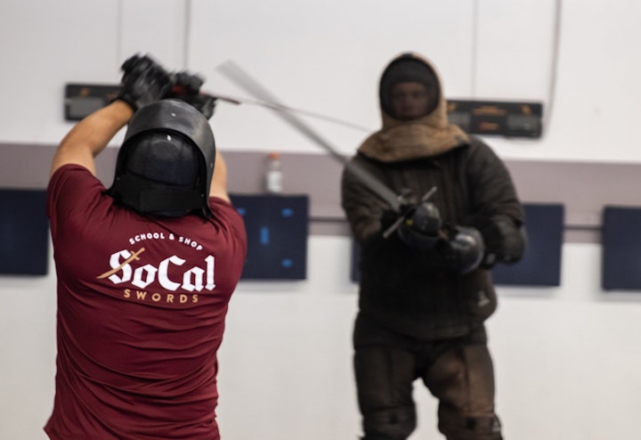
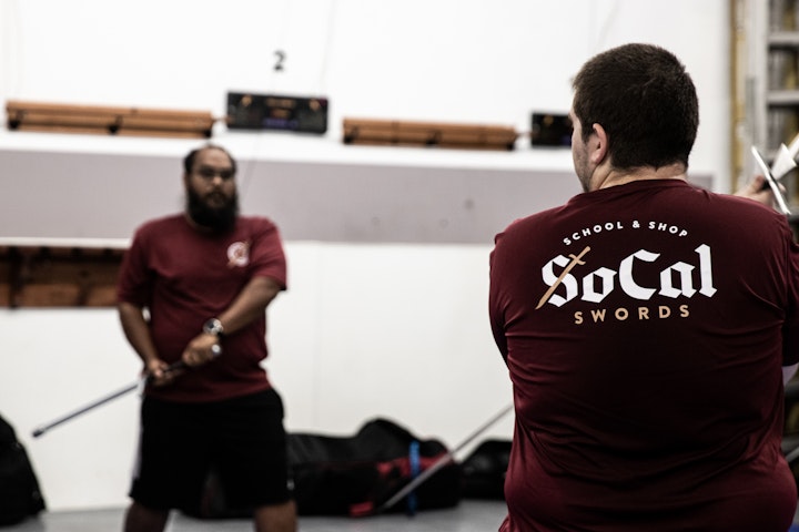
SoCal Swords, a Historical European Martial Arts (HEMA) club and online shop in Southern California, was in need a a new logo and cohesive branding. The client was open to exploring any direction for the project.
Logo
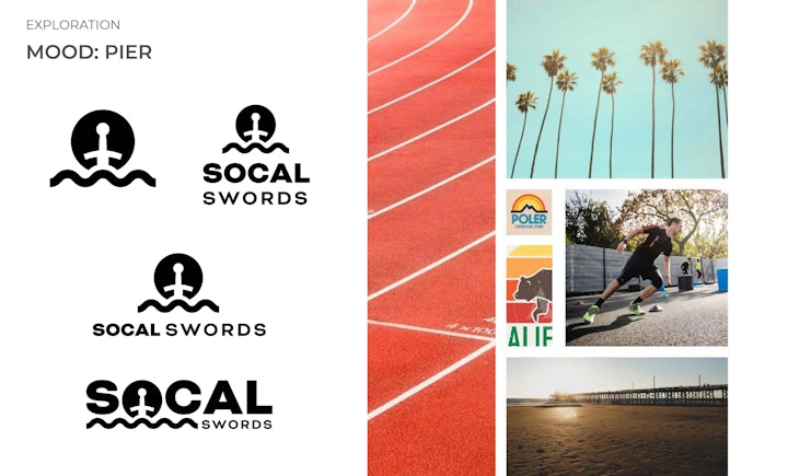
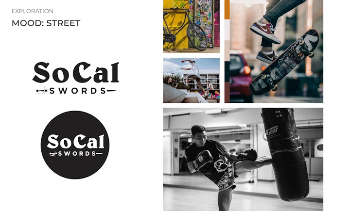
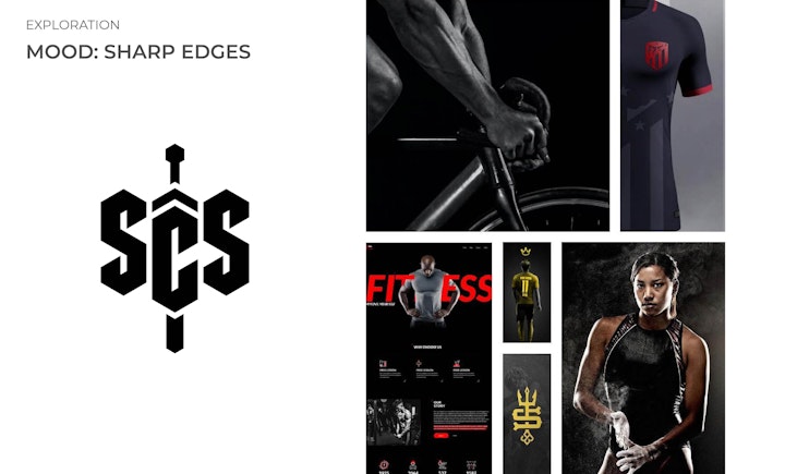
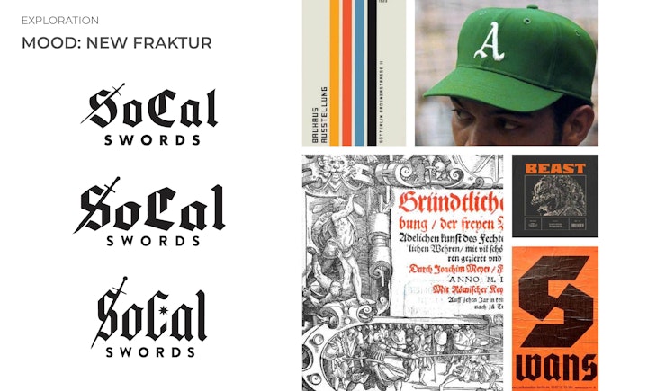
With limited parameters set for the logo design we presented a handful of options. While we normally don't try to cast a wide net we felt it was applicable to offer a large selection of moods and styles to help our client find their voice. We presented 4 main ideas with accompanying mood boards to show how we envisioned the final product.
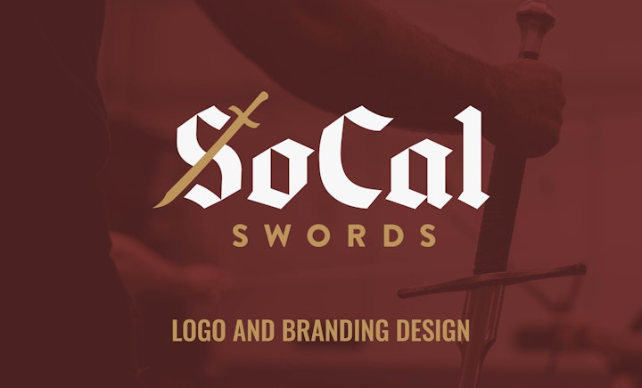
The client found the "New Fraktur" (Fraktur meaning: a German style of black letter) idea the most compelling for their brand and wanted to pursue that idea. The concept behind this idea was to put a modern spin on black letter which is found in historical fencing manuscipts that the sport studies from.
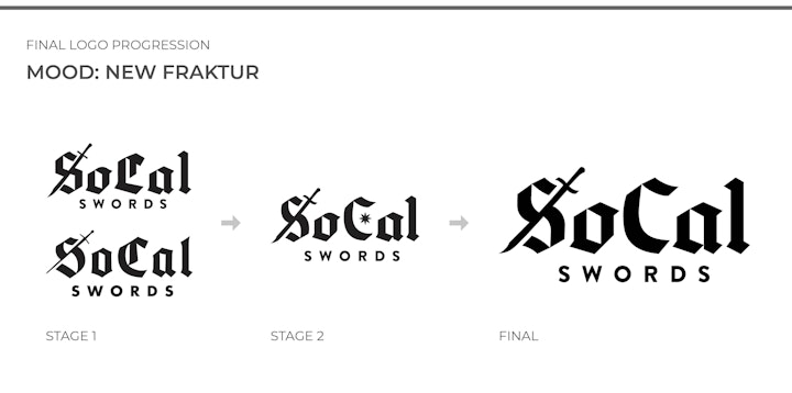
Because we wanted to maintain legibility as much as possible we adjusted the typography to have a more modern version of the "C" omitting the decorative elements or "L" shaped strokes that are often found in black letter. We also adjusted the "S" to match the new design of the "C"
Branding
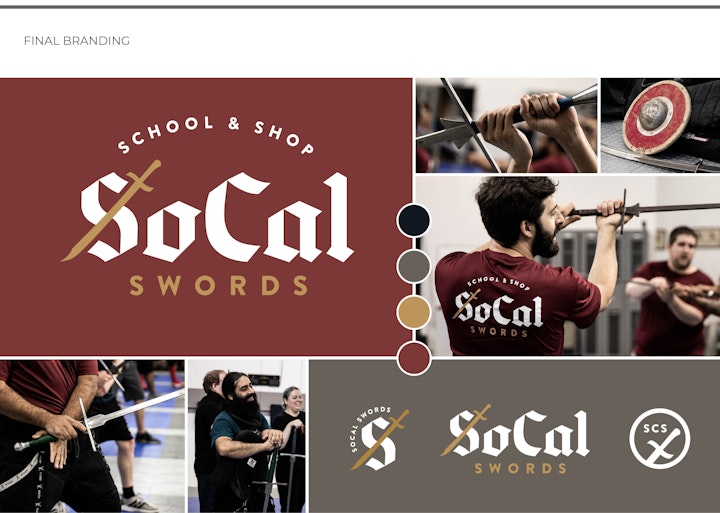
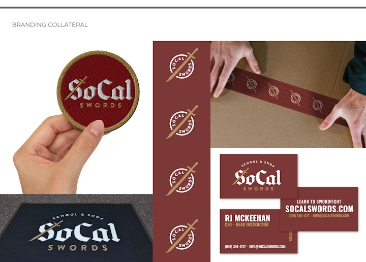
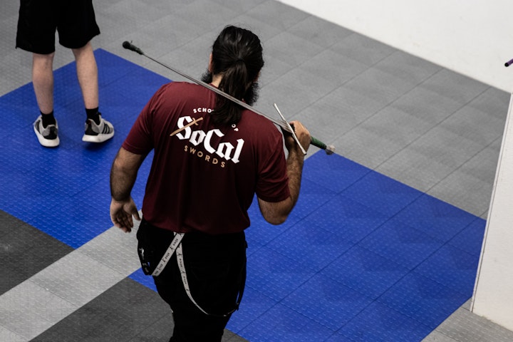
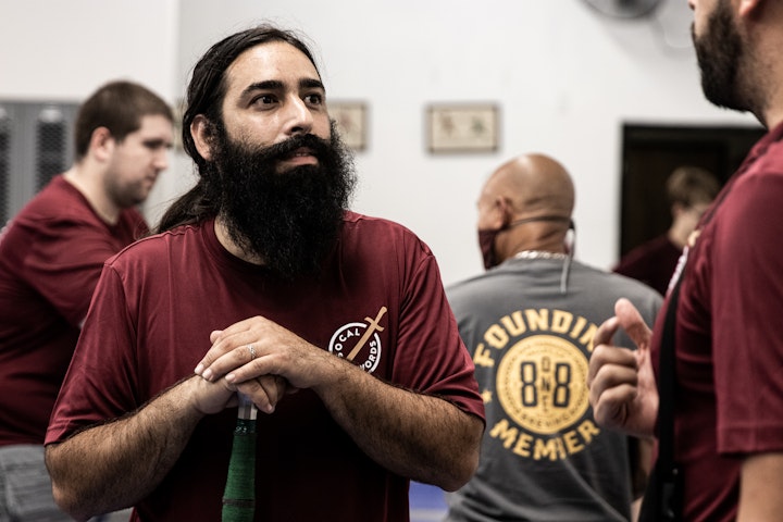
As mentioned above the client resonated with the idea of combining new with the old that was featured in the "New Fraktur" mood board. We accomplished this by combining more modern elements, like a tall sans serif font, with more historical feeling elements, like maroon and gold.
Skill Developed
- Word Mark Design
- Mood boarding
- Client Communications

