
Logo & Packaging | Hamish & Co.
Sydney – Graphic Design
Overview
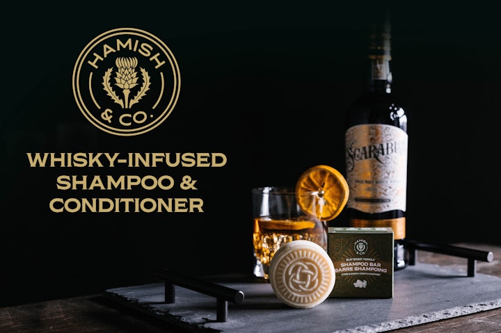
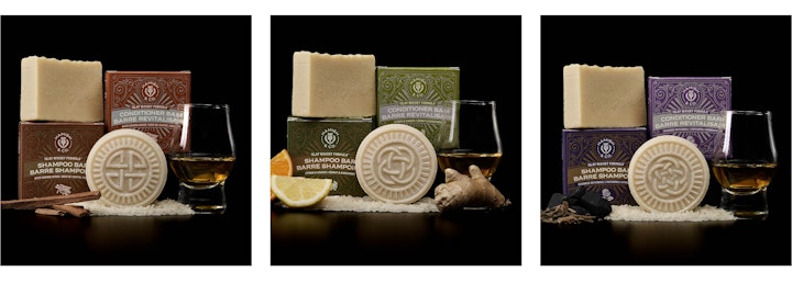
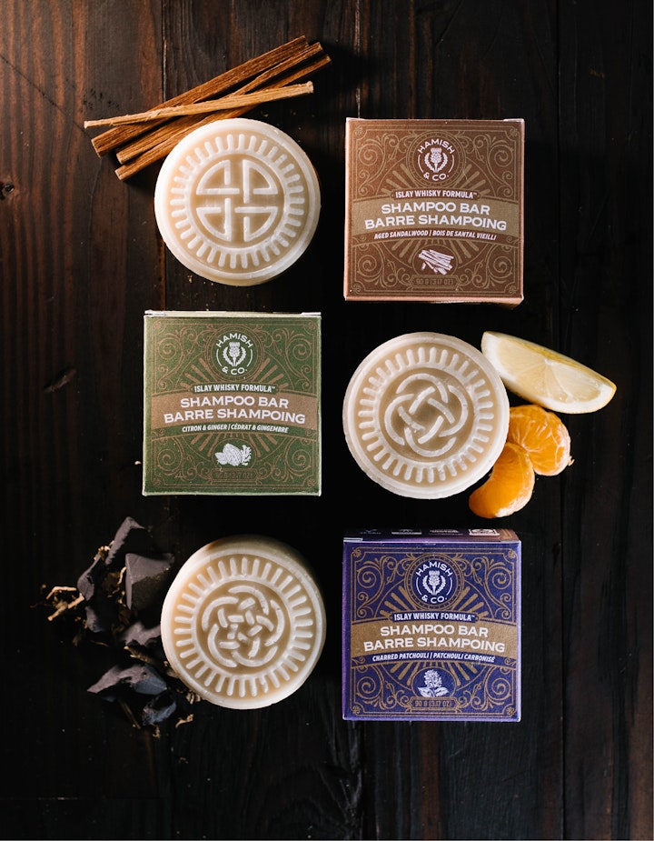
Create branding and packaging for a men's hair care brand. The brand sells whisky infused shampoo and conditioner bars using Islay Whisky from Scotland. The goal was to create high-end packaging inspired by whisky bottle labels.
Logo
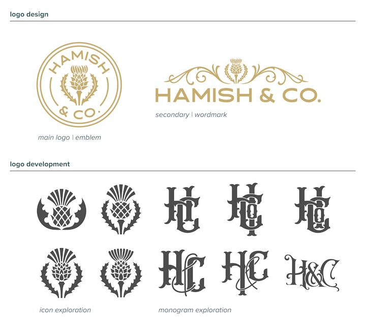
I wanted to create a logo the resembled a seal as an additional call back to the iconography of whisky labels. I chose to design a thistle icon as it is a symbol of Scotland. The main challenge was to create a thistle that was unique enough to stand out among the many thistle icons around while avoiding looking like a pineapple. Another challenge faced was to have enough detail to look like a thistle while not being too busy for small scale uses. During the development we wanted to see if a monograph would be appropriate. I designed a few before we decided to stick with the original direction.
Packaging
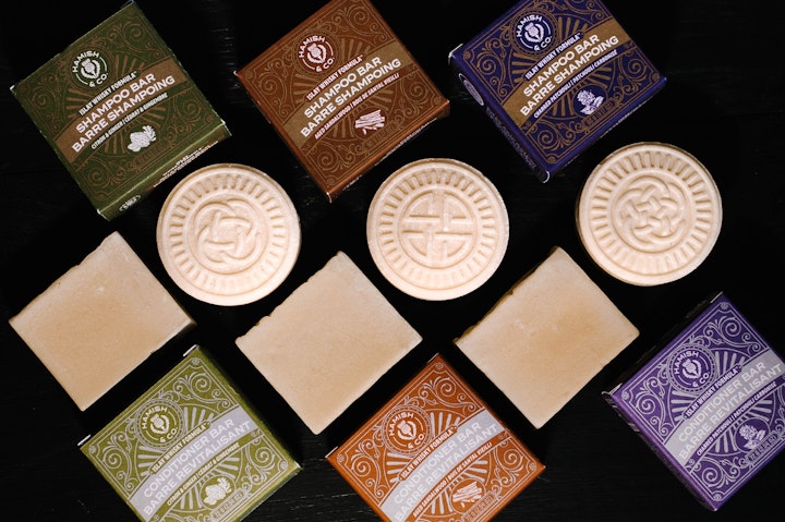
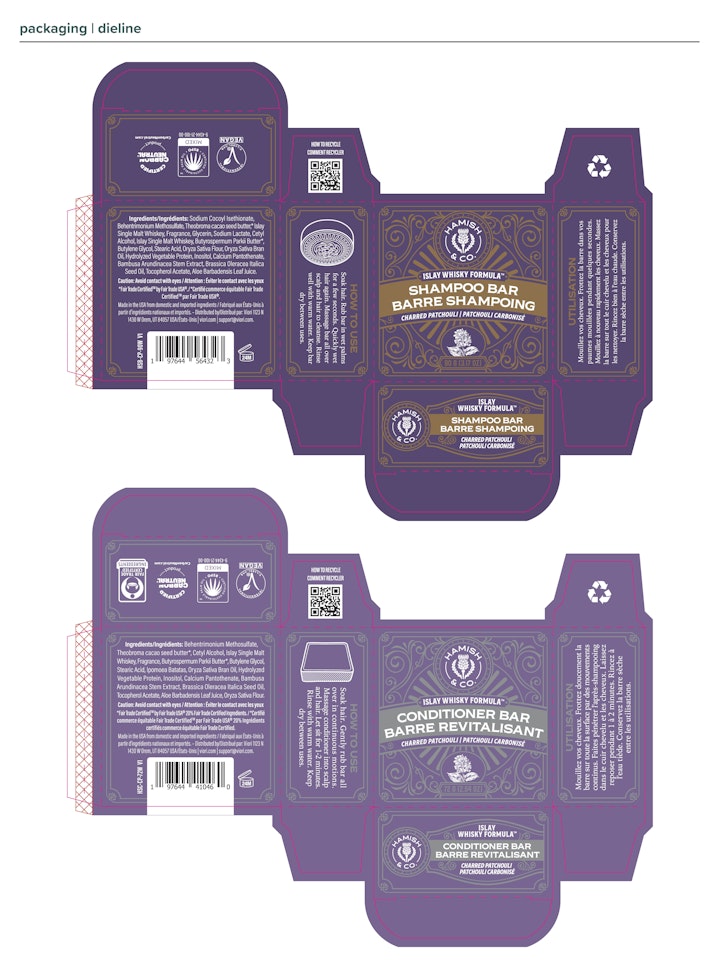
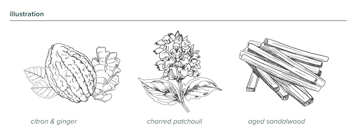
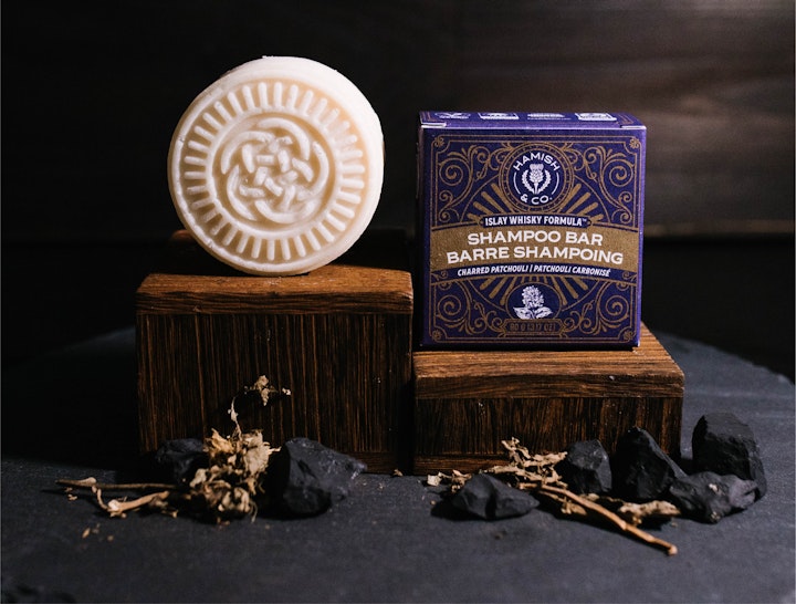
As mentioned, whisky labels were the main inspiration for the packaging. Balancing the amount of decorative elements among the product info was a fun challenge to make sure the space was filled without being overwhelming or feeling too sparse. I wanted to included detailed line illustrations of the scent to add some visual interest and to call back to many whisky labels that include illustrations of ingredients or the distillery.
Some challenges faced:
- Fitting all the required info in both English and French is always a fun challenge to make sure the hierarchy remains while keeping type an appropriate size.
- Making sure there was enough contrast between the metallic ink and the other colors was tricky to imagine with just the Pantone swatches. I was able to attend the press check where we worked to adjust the density of the inks to ensure the contrast was what we had imagined.
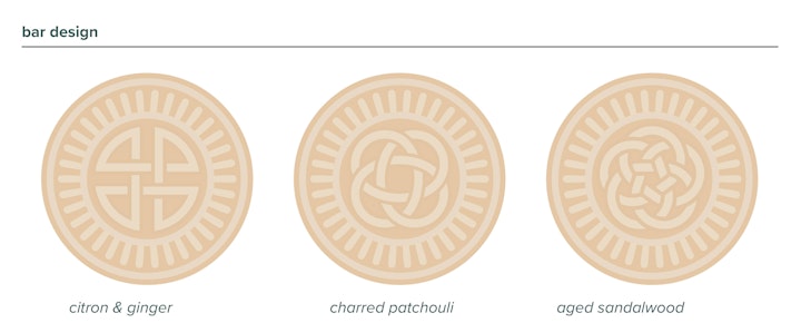
Bar Design
We wanted to use Celtic knots to differentiate the scents so I designed them within the specs required for our bar molds. I wanted to added some extra visual interest and decided to use the ray graphic that is found on the packaging to add some cohesion between the bar and packaging.
Skills Developed
- Icon Design
- Illustration
- Understanding press check processes
Photos courtesy of Viori